
MySeminary is a web-based app where seminary students from the Church of Jesus Christ of Latter-Day Saints can perform a variety of tasks related to their seminary studies. It’s designed to be fully functional on both desktop and mobile devices. Some of the primary functions include the following:
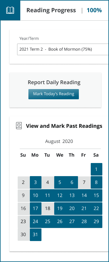
• Tracking and recording reading progress
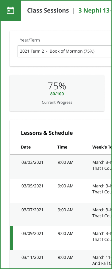
• Viewing class information, schedules, and lessons
• Tracking graduation progress
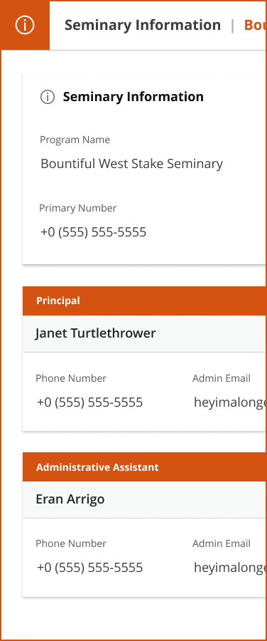
• Viewing seminary program information
_
A REMAKE REIMAGINED
I was hired to redesign, streamline, and expand MySeminary’s user portals. As the sole designer assigned to this project, I had more room to flex my creative muscles and innovate unique ways to engage young minds.
After completely revamping the student portal, I created two new portals for both parents and church leaders—each with their respective feature sets.
PARents
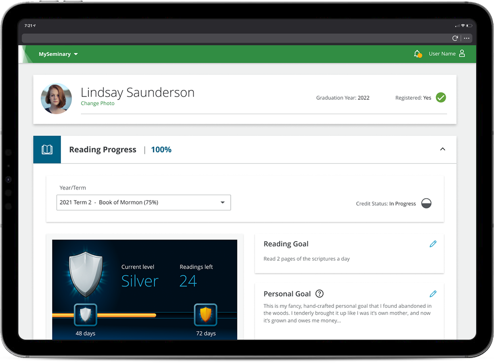
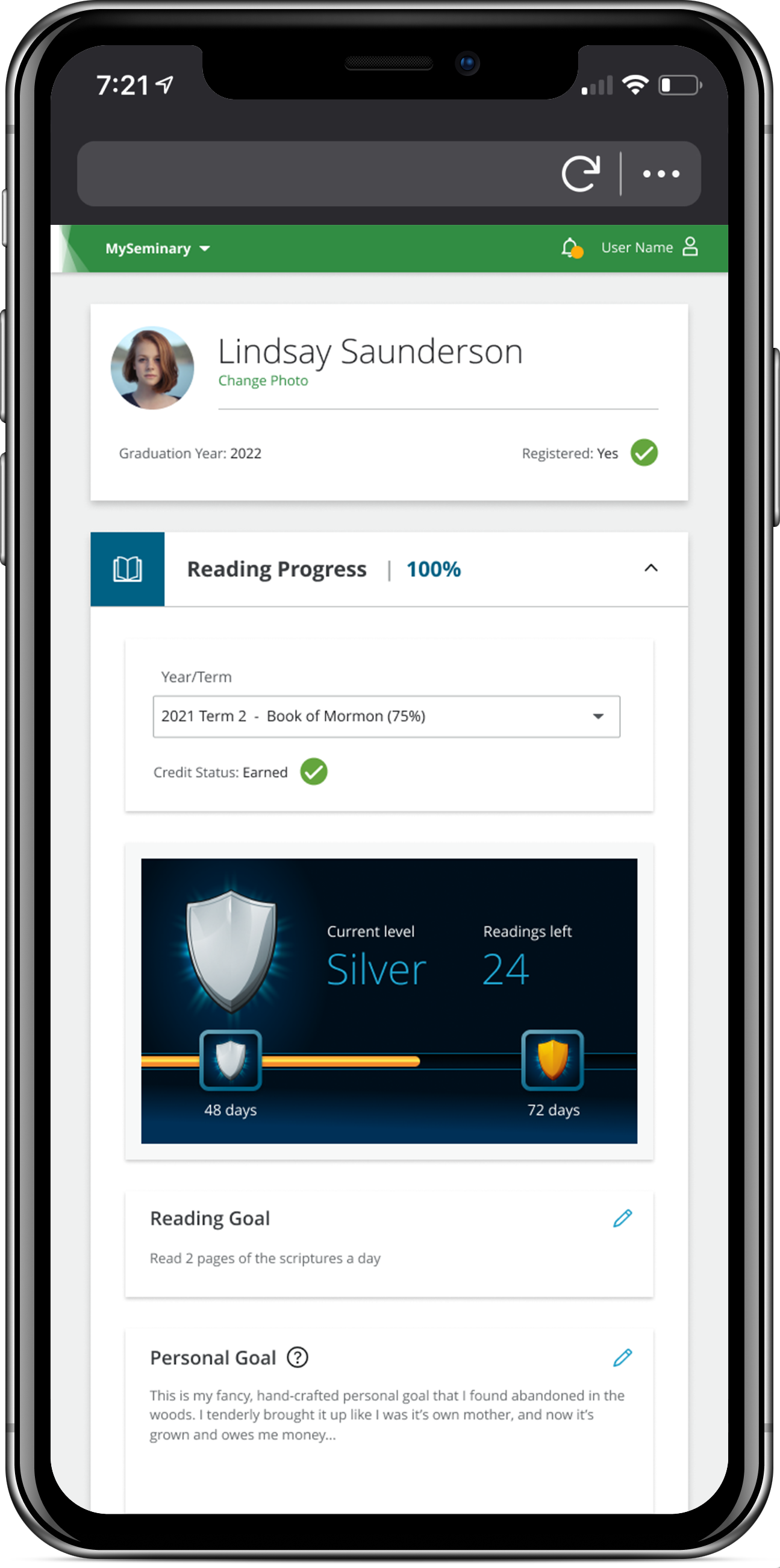
This portal allows parents to view all information available to their seminary-age children. They’re granted the same access as the student version, minus some gamification elements.
LEADERs
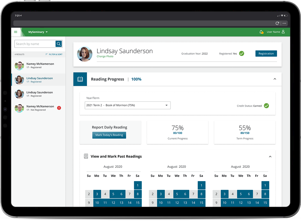
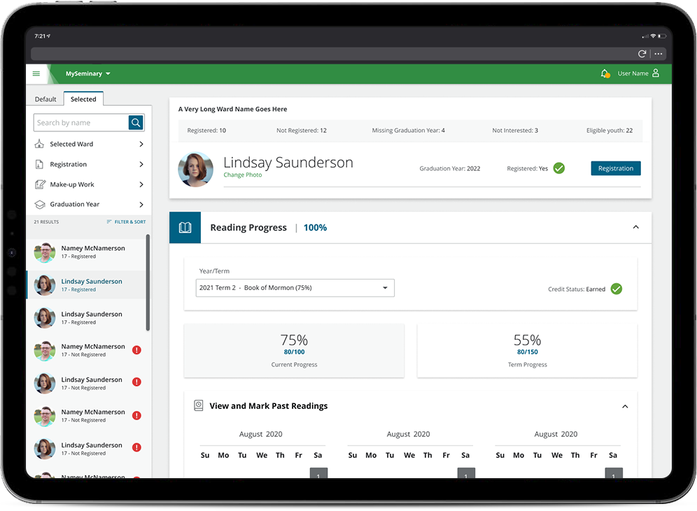
Local church leaders now also have access to their own portal. This version focuses primarily on students’ seminary progress and omits more personal information.
_

Bronze

Sliver

Gold

Diamond
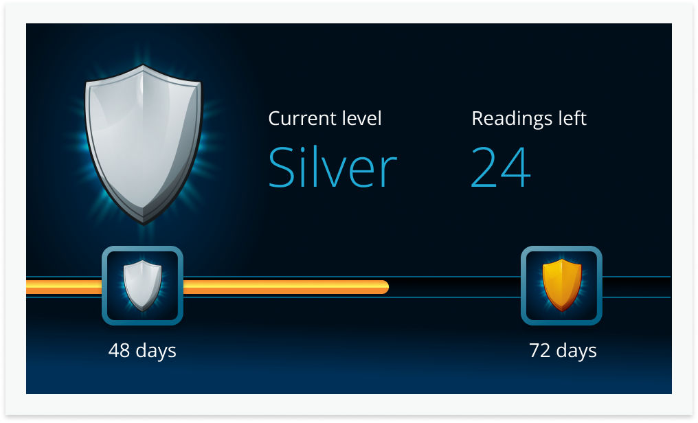
GAMIFICATION
I wanted to introduce game-like elements to the reading experience to encourage students to stay engaged with their assignments. Since this idea was not a part of the project’s initial bid, I put together a brief presentation and pitched the concept to the church’s business department. They gave me the green light to implement a basic leveling/badge system where users need to read at least 75% of the assigned text (the minimum amount to pass) to get a gold badge.
My work on this project earned me the highest accolade: my daughter says it's cool.
_
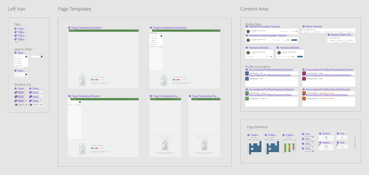
Design Language
I was fortunate enough to be the first designer in charge of this redesign. (Most of the projects I’m placed on require me to manage multiple designs from previous artists.) As such, I was able to create a cohesive style based on simple usage of color and iconography.

As always, I strive for AAA contrast standards—AA bare minimum. Icons assist users who are colorblind as well as maintain a consistent pattern for each type of interaction. Ensuring my components are standardized helps the design maintain uniformity.
MySeminary gave me the opportunity to combine my creativity with my years in the UI/UX industry to design a one-of-a-kind user experience—one I get to see used and enjoyed every day by my own family.